Toursoft Mobile App
A field companion for the TourSoft platform. Your whole trip in your pocket, offline when it matters and synced when you get back online.
Lead Product Designer
2023–2025 (alongside TS Systems)
B2B companion app · iOS & Android
Highlights
As lead designer I owned this end to end: research, IA, interaction, and visual design, all the way to hi-fi on iOS and Android. The whole project really came down to three decisions. How much app to build, how a trip gets onto the phone, and how a packed multi-day trip should read in the field. Everything else just supports those three.
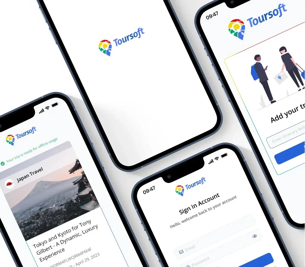
A companion to the TourSoft platform
TourSoft Systems is the desktop platform where agencies build itineraries, handle quotes, and run their operations. The mobile app picks up in the one place desktop can never go: the trip itself. That framing set the boundary for everything below. Mobile is for reading and carrying a trip, not building one.
The platform stops at the office door
Tour operators build and sell trips on the TourSoft desktop platform all day. But trips get used somewhere else entirely: in airports, on coaches, at hotel check-ins, often with patchy signal or none at all. The moment someone leaves Wi-Fi, the itinerary they need most stops being reachable. So people fell back on screenshots and printed PDFs. Those go stale the second a plan changes, and they are cut off from the live platform. The brief I set myself was simple: get the trip into the field without cramming the whole desktop product onto a phone.
The field, not the office
Most of what I learned came from talking with operators and reviewing support patterns on the desktop product. I mapped when people actually pull out a phone for trip details: airport transfers, coach rides, hotel check-ins, a client asking something on the spot. The moments were always similar. High stakes, not much time, and usually where the signal is worst.
The biggest tell was how people coped. They screenshot the itinerary or printed a PDF. Both go stale the moment anything changes, but people trusted them anyway because they work with no signal. That was the insight the whole product turned on. It stopped being “TourSoft on a phone” and became “the trip, carried,” which is what shaped the three decisions below.
- Field use is occasional but high-stakes. A missed voucher or a wrong pickup time has consequences right then.
- Offline access was the price of entry. Without it, people would just keep using their screenshots.
- Operators build on desktop and read on mobile. The job on a phone is clarity under pressure, not matching every desktop feature.
A companion, not a clone
The first real decision was how much app to build. The obvious move was to put all of TourSoft on a phone: itinerary building, quoting, CRM, the lot.
I pushed back on that. Copying the desktop tool feature for feature would just give people a worse version of something they already had. So I kept mobile to the jobs that happen in the field and left the rest on desktop. The focus was the point, and saying no to everything else was the hard part.
- Considered: a full mobile port of the platform. It would compete with the desktop tool and lose.
- Chosen: a focused companion that gets the trip, reads it offline, and carries its documents.
- Left out on purpose: building, quoting, CRM, and procurement all stay on desktop.
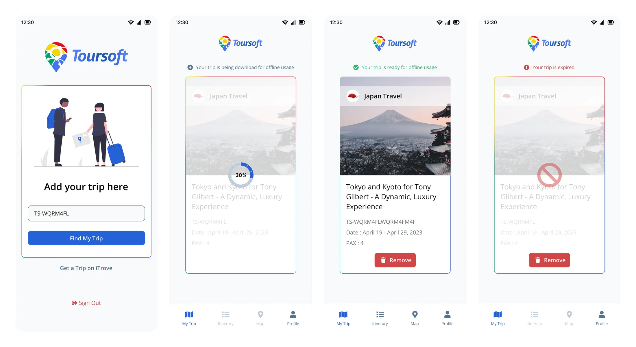
Download the whole trip, don’t stream it
With the scope settled, the big one was how a trip actually gets onto the phone. That choice drives everything after it: the navigation, the states, and how much someone has to trust the app.
Field use happens where the signal is worst, which is exactly when the itinerary matters most. I tested two delivery models before committing to one.
Stream on demandRuled out
Fetch each day, place, and document from the server as the user opens it.
- Fails in the exact moment it is needed: no signal, no itinerary
- Every screen risks a spinner or an error in the field
- Brings back the same problem people already solved with screenshots
Download the full tripThe call
One trip code pulls the entire trip to the device, with background sync when back online.
- Everything works offline by default, not as a fallback
- Clear downloading, ready, and expired states build trust
- Sync turns into a quiet bonus instead of a dependency
A trip code pulls down one complete trip. A progress state shows it filling up, and a plain “ready for offline usage” message tells people they can put the phone away and count on it. Expired and remove states close the loop, so an old trip never pretends to be current.
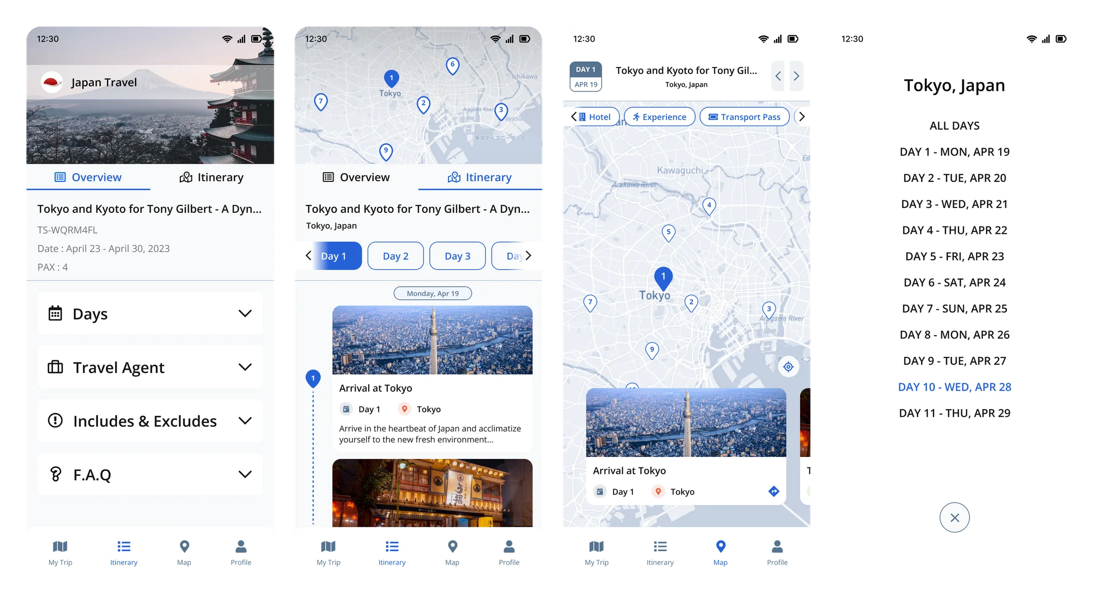
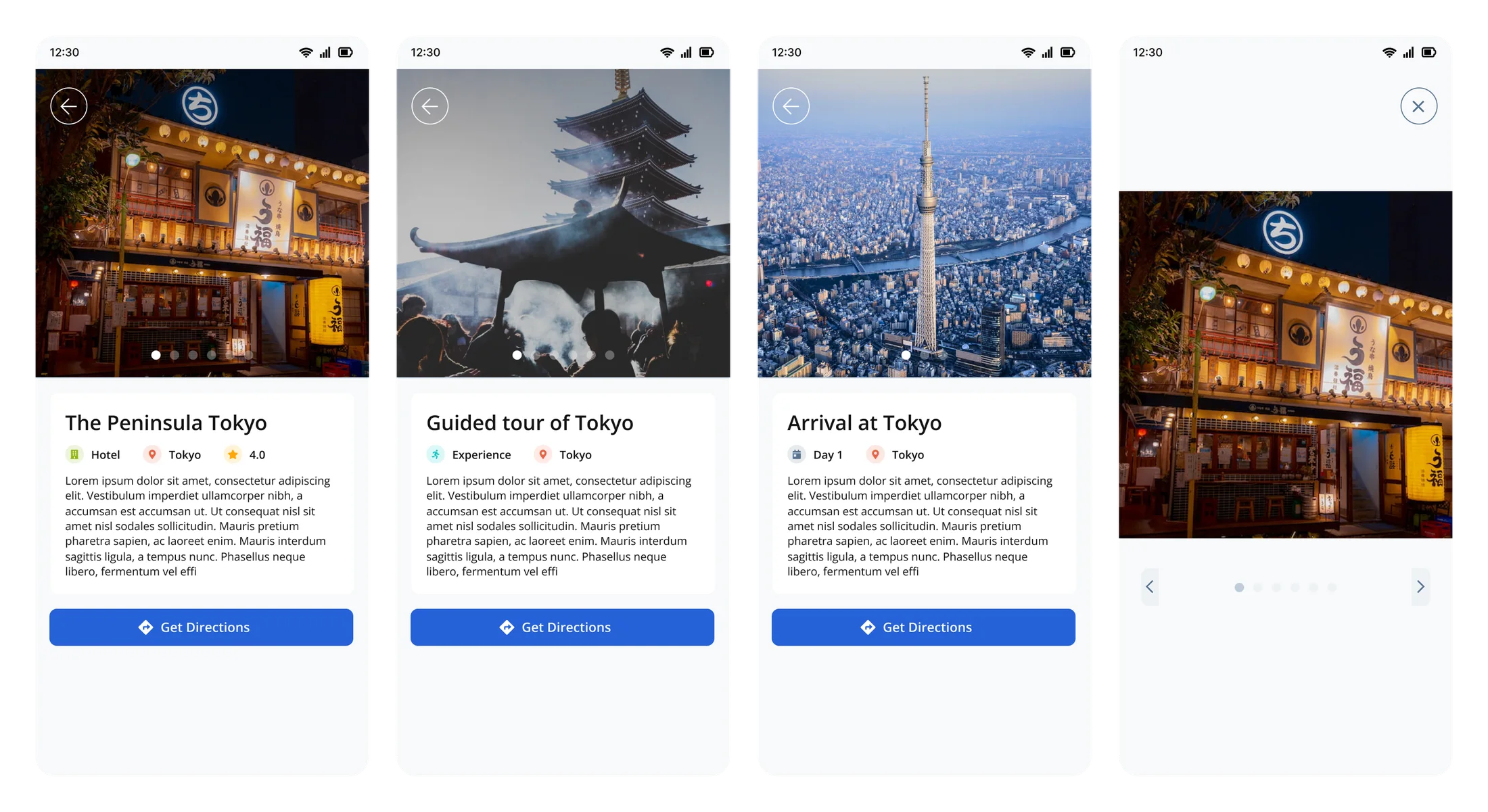
A map and day cards, not one long document
With the trip on the device, the last decision was how to make a packed multi-day plan readable on a phone, usually in bright light and one-handed.
The default approach is one long scrollable document. It hides where each day starts and turns “what’s tomorrow?” into a scroll hunt. I went with a map first, then day-by-day cards and a day picker that stays put. You see the shape of the trip first, and any single day is two taps away.
- Considered: one long scrollable itinerary. Day boundaries disappear and it is hard to scan in the field.
- Chosen: a map overview, day cards, and a day picker that holds across an 11-day trip.
- Contrast and spacing tuned for movement and sunlight, so the hierarchy holds up at a glance.
From a screenshot to a trip that lives on the phone
It is worth seeing the shift plainly. The old way was a screenshot or a printed PDF. Fine until a plan changed or the signal dropped, and then useless. The new way is a single code that puts the whole trip on the device, current and readable anywhere.
- Before: screenshots and PDFs. Stale the moment anything changed, cut off from live data, easy to lose.
- After: one code, the full trip downloaded, always current and fully offline.
- Same job, far less doubt. People stopped second-guessing whether what they were holding was right.
Everything else, kept out of the way
The three decisions above are the real story. The rest of the system was built to the same standard but kept quiet on purpose. Here it is in one pass.
How it all fits together
A shallow four-tab base (My Trip, Itinerary, Map, Profile) keeps any voucher or pickup time two taps away. The structure also carries the offline model, with clear downloading, ready, and expired states.
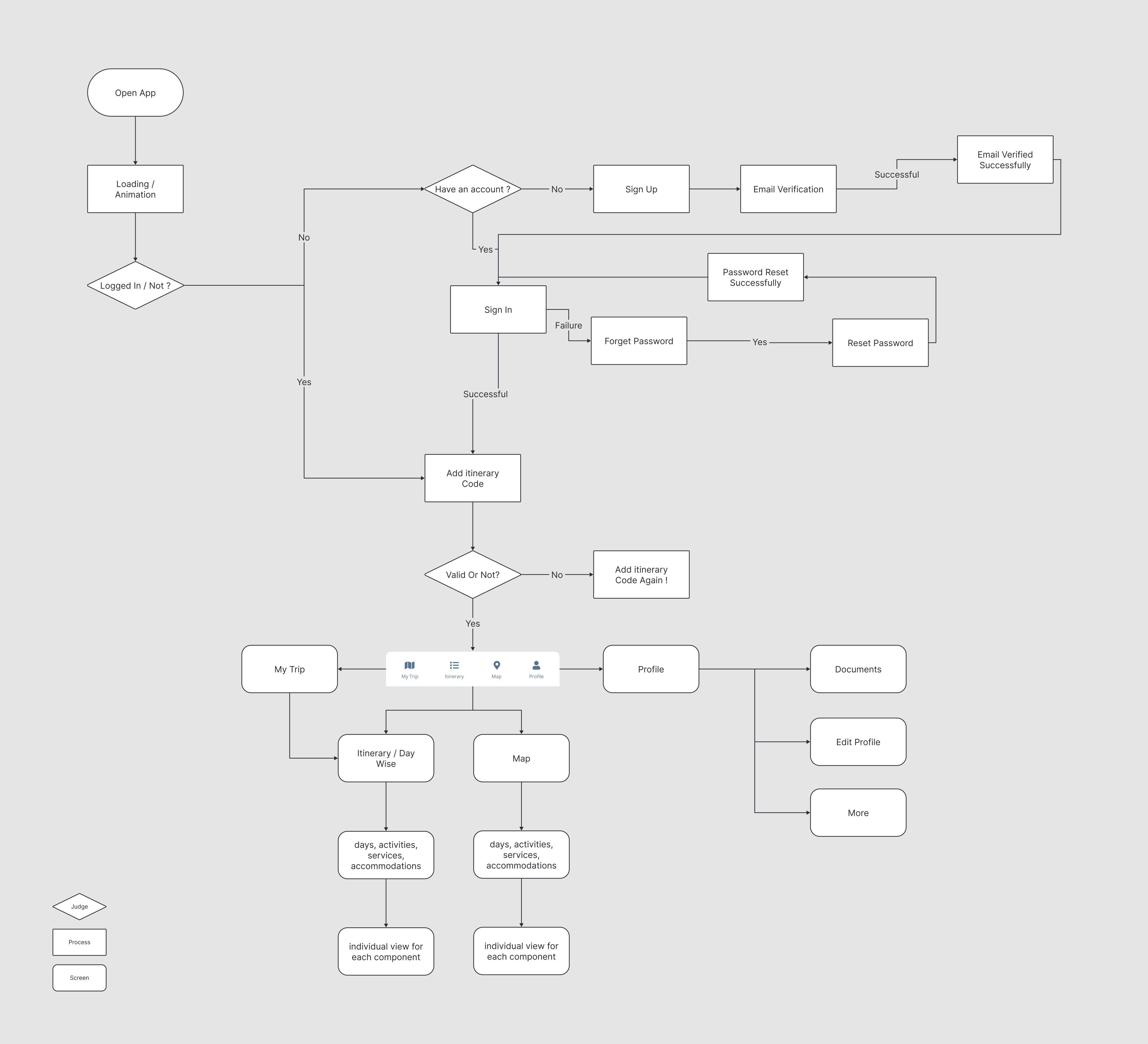
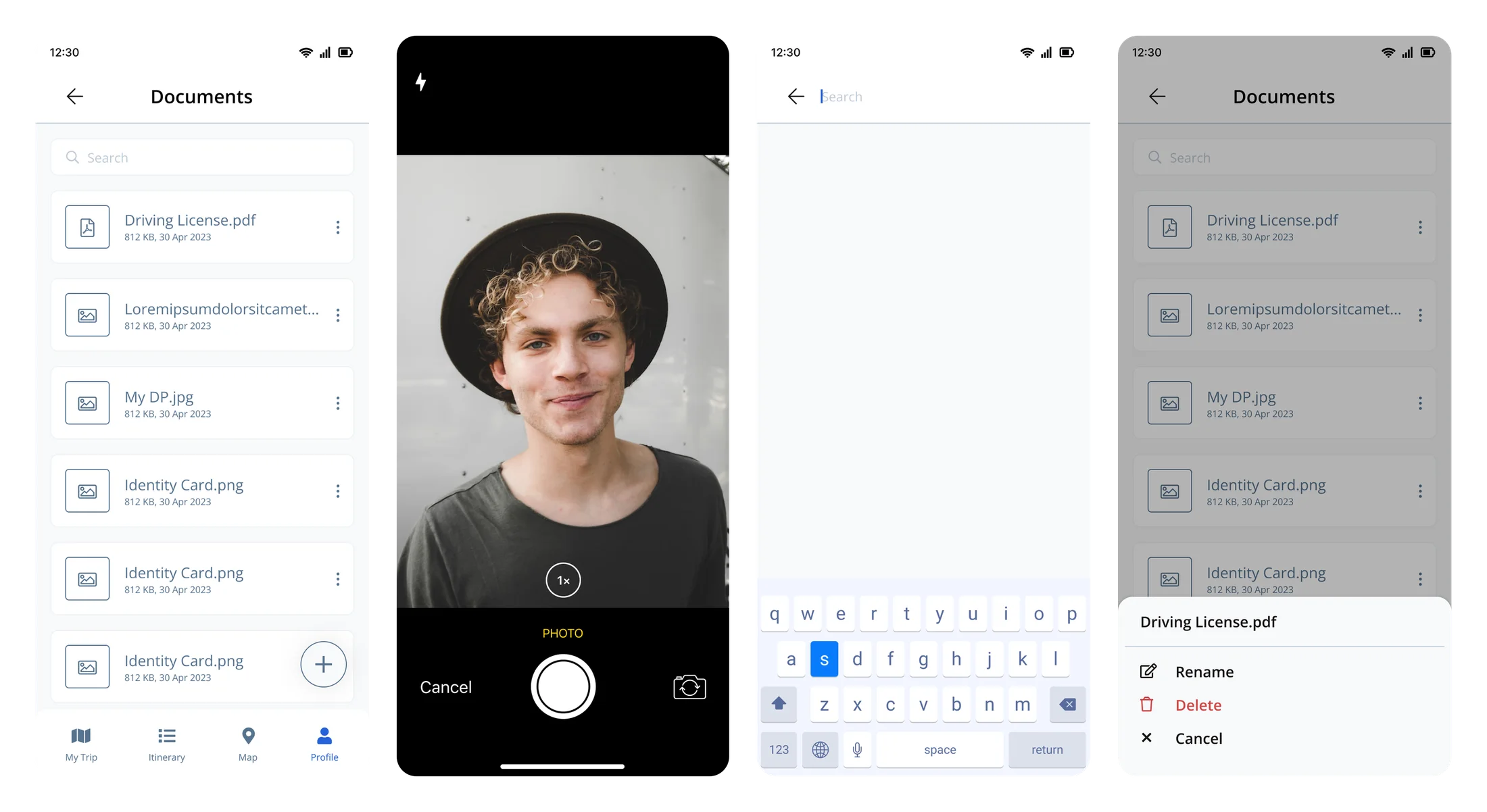
Documents & detail views
Vouchers, IDs, and files travel with the trip. They are searchable, can be captured with the camera, and stay available offline. Behind each day, detail views answer the obvious questions: where am I going, is it any good, and how do I get there.
Testing the assumptions that mattered
I checked the three decisions with clickable prototypes and sessions with internal stakeholders and agency operators who already knew TourSoft. I focused on the things the product would live or die on: whether people trusted it offline, whether it stayed readable under pressure, and whether it felt like a real extension of the platform they already used. Across those sessions it landed at a 4 out of 5 satisfaction score.
Our guides love having the whole trip right on their phone. It has made running tours on the ground so much smoother for the team.
- Operators liked the calm, document-style reading and reacted badly to anything that felt like a dashboard squeezed onto a phone.
- Offline indicators had to use plain words. Technical sync language confused non-technical field staff.
- The scope decision kept holding up. People preferred the focused companion over a bigger port.
- Sharing the look with TS Systems and iTrove made it easier for existing customers to pick it up.
Outcomes
What I learned
What I'd do differently
I would prototype the offline edge cases sooner. Partial downloads, expired trips, and stale data are where mobile trust is actually won or lost, and I got to them a little late. I would also test in real low-signal places instead of leaning on airplane mode.
Lessons
A companion app works when it does a few things really well. The decisions that mattered here were mostly about restraint: what to leave out, and how to make the handful of things it does feel completely reliable offline.
Tradeoffs
I kept mobile to reading and carrying a trip rather than building one, and went with calm single-column layouts instead of the dense tables that work on desktop but fall apart on a phone in sunlight.